.png)
Getting a user to tap your social media bio link is a major milestone. You have successfully interrupted their endless algorithmic scroll, convinced them your offer has value, and prompted them to exit the native social feed.
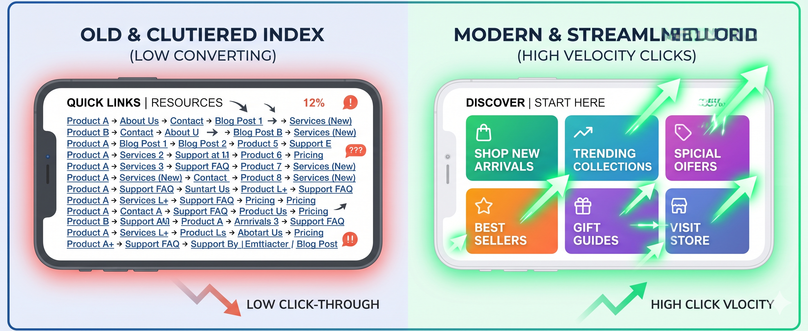
But what happens next determines your actual bottom line. If that hard-earned traffic lands on an uninspired vertical list of ten plain text buttons, user motivation stalls.
Many creators and brands think the click-through path ends at the profile page. In reality, the architecture of your mobile micro-landing space handles the heaviest conversion work. If your current mobile hub looks like a cold link index, your layout is driving potential conversions away.
To convert passing curiosity into active, measurable sales, your link directories must act as real-time, visual extensions of your content. Let's look at how to layout elements on mobile screens to maximize user interaction.
1. Upgrade Stale Lists into Interactive Visual Cards
Human beings process visual images 60,000 times faster than raw text strings. When a visitor lands on your page, their eyes immediately search for visual anchors. A uniform stack of text buttons forces the brain to read every option line-by-line, slowing down the path to action.
Instead of generic button lines, use visual grid cards or image blocks. If your video featured a specific jacket, display a high-resolution, cropped thumbnail card of that jacket next to the link button. Matching your social media imagery directly with your link targets removes mental friction and boosts user interaction rates.
2. Implement Sub-Headers to Categorize Intent
If you offer different types of value—such as digital downloads, affiliate recommendations, or consulting links—do not mix them together in a single disorganized pool. Group your targets into clear, distinct content zones using minimal text headers.
🔥 CURRENTLY VIRAL
[ Link to latest YouTube tutorial / Product drop ]🛒 SHOP THE FEED
[ Card 1: Camera gear ] [ Card 2: Workspace setup ]🎁 FREE RESOURCES
[ Download the ultimate creator template ]
🔥 CURRENTLY VIRAL
[ Link to latest YouTube tutorial / Product drop ]

🛒 SHOP THE FEED
[ Card 1: Camera gear ] [ Card 2: Workspace setup ]

🎁 FREE RESOURCES
[ Download the ultimate creator template ]
Structuring your sections chronologically or by specific categories allows users to jump directly to the target that matches their intent, reducing the chance they get overwhelmed and bounce.
3. Position Crucial CTAs Above the Mobile Fold
The "fold" refers to the bottom border of a mobile screen before a user begins scrolling down. In mobile-first web tracking, any link placed below this initial line experiences a massive engagement penalty.
Real-world mobile user analytics show that elements placed entirely above the fold receive over 102% more user focus than items hidden further down the page.
Keep your primary announcement, email collection forms, or highest-converting link locked within the top 300 pixels of your landing layout. If a user has to scroll down to figure out what you want them to do, you have already lost a major percentage of your potential conversions.
Optimize Your Mobile Funnel for Immediate Action
Securing an initial click is a fantastic start, but keeping that user engaged on your page requires a high-velocity, visually engaging mobile layout. Stop presenting your audience with simple text lists.
Ready to build a visual, high-converting mobile layout? Launch your LinkNitro hub now.